
How Loyola University delivers a first-class learning experience for students worldwide
Providing reliable and accessible digital services is essential for universities to uphold their reputation. Over half of students prefer application and acceptance processes to be online and 63% consider hybrid learning to be ideal, highlighting the importance of meeting user demand for digital services throughout the university experience.

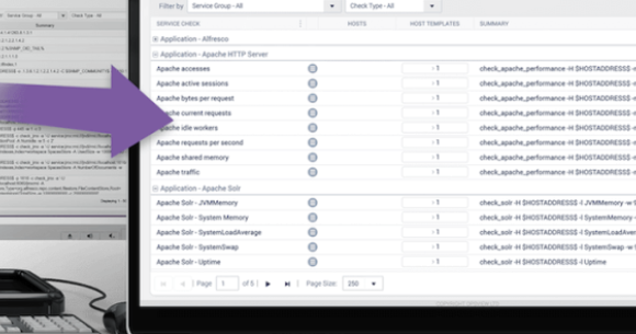
What is IT Monitoring?
At Opsview, like in many other IT monitoring and Application Performance Management companies, we like to talk about the next generation of monitoring and the new features that are constantly being released and developed; from multi-tenancy and scalability through to service monitoring and dashboards, etc.

How Advania provides optimal infrastructure performance 24x7
With Opsview, Advania gains smartly priced, always-on infrastructure monitoring for any IT environment including on-prem, which many of its customers rely on for the security and control it offers.
How to Configure SNMPv3 Traps
We have various articles already in our documentation for setting up SNMPv2 trap handling in Opsview, but SNMPv3 traps are a whole new ballgame.
APC UPS Monitoring - Useful OIDs
For APC UPS monitoring, here are some of the OIDs (Object Identifiers) you'll want to use.